


Overview
CSCE 453H - Honors: User Interfaces
DESIGN EVOLUTION NARRATIVE
Steezy by Zach Girouard
THE PROBLEM
As a skateboarder, I've always found it difficult to shop for skateboards online. The most difficult part, I noticed, was that it was hard to get a good idea of what the skateboard would look like in person based on what it looked like on the website. Additionally, I believe that skateboard ecommerce website could do better when it comes to providing users with more customization options, even allowing them to create custom designs for their decks. Overall, I wanted to construct a more creative and interactive experience for the end-user.

THE INSPIRATION
Similar to Nike’s “Nike By You”, I wanted to give users a three-dimensional rendering of their skateboard as they went through the design process. I've always admired Nike's design tool as it's extremely interactive and pushes the boundaries for what can be done on an ecommerce website.
The three-dimensional rendering not only gives users a better understanding of what their board would look like, but it also provides them with a more entertaining process, almost as if they are playing a video game. The name, Steezy, comes from a term in skateboarding that means to do something difficult with style and to make it look effortless. Lastly, the color scheme, design, and language of the website comes from the boldness of skateboarding, mixed with ideas from video games design tools.


BRAINSTORMING & SKETCHES
Steezy was a solo project I designed through my “Honors: User Interfaces” class at the University of Nebraska-Lincoln. I began my design process by sketching out some features I thought I might include in the interface. At this stage in the process, nothing was too crazy or out there for the project.
The first feature I thought of was a creative interface that allowed users to make their own designs for their decks which they could later include as part of the “Build Your Own Board” process. I took inspiration for this feature from other creative interfaces such as Adobe Illustrator.

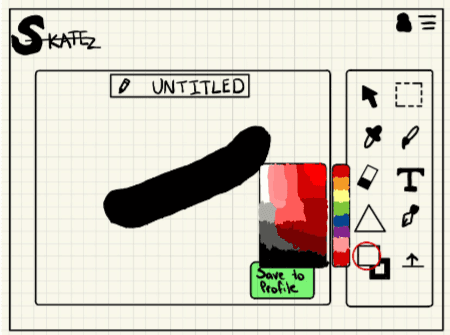

As you can see, the interface provides ways for users to add shapes, text, and pen strokes to their deck and then save it to their profile. I also originally had the name for the site as “Skatez”. However, this felt a little uninspired, and I’m glad I changed it to “Steezy”. Ultimately, this feature was not included in the final prototype for Steezy. Despite this, I still think this would be a cool idea for later versions of Steezy if it went into development.
INTERFACE CHOICE
As I moved further along into the design process, I quickly decided that this project would be best suited for a desktop interface. Although a mobile application could be developed later, I imagine most users would prefer a desktop interface that gives them a higher resolution version of their board. This would give users a better understanding of their purchase, and it would create a more interactive buying experience. A mobile interface for this project would make it harder for users to interact with the three-dimensional rendering, and would limit the ability of CSS effects such as hover, requiring a redesign.

USER STORY
I also brainstormed more about what my typical user may look like, and created a user story that helped shape my design. This user story follows Ben Roter:
——————————————————————————————————————————-
“Ben Roter is a 21-year-old skateboard enthusiast with a background in digital marketing and design. After breaking his old board at the skate park last weekend, Ben is looking to build a new skateboard that reflects his personality and creative flare. His friend recommended he try a new website that allows users to customize their own skateboard decks. After a long day of work, Ben settles onto his couch and opens his laptop, excited to try this new website. Ben is looking to design a skateboard that he can ride to work in the mornings, but also at the skatepark when he has time.
Ben’s home is well-lit, with quick internet speeds. He occasionally has to get up during his web session to do various chores, or answer calls from family and friends. Upon opening the website, Ben is greeted with a well-designed page prompting him to either sign in, create an account, or continue as a guest. Since he’s not sure whether he needs an account, Ben decides to continue as a guest. From there, Ben is taken to a stunning homepage featuring popular user designs, different skate parts, and a comprehensive navigation bar. In the navigation bar, Ben sees labels for: “Skateboard Parts”, “Pre Built Skateboards”, “Design Your Own Deck”, “Build a Custom Skateboard”, and “Community Designs”. Ben is intrigued by the “Design Your Own Deck” option, and hovers over the text, revealing a dropdown navigation with more options under each main navigation item. Still interested in designing his own deck, Ben clicks on the navigation item. He is taken to a page with a grayed out background and a notification prompting him that he must create an account to design his own deck with a small button to sign in or create an account. Ben then clicks the button and signs up using his personal email.
After navigating back to the page, Ben sees that there is a blank skateboard in the center with tools on the top and side containing different icons. Being in a design field, Ben recognizes most of the icons as allowing him to draw on the board, add shapes, or change the background color. For the icons he doesn’t know, Ben hovers over them and is prompted with a description of what the tool does. Ben spends some time designing a board, and when he’s done, he saves it to his account. After saving to his account, he gets a call and closes the site, returning about 30 minutes later.
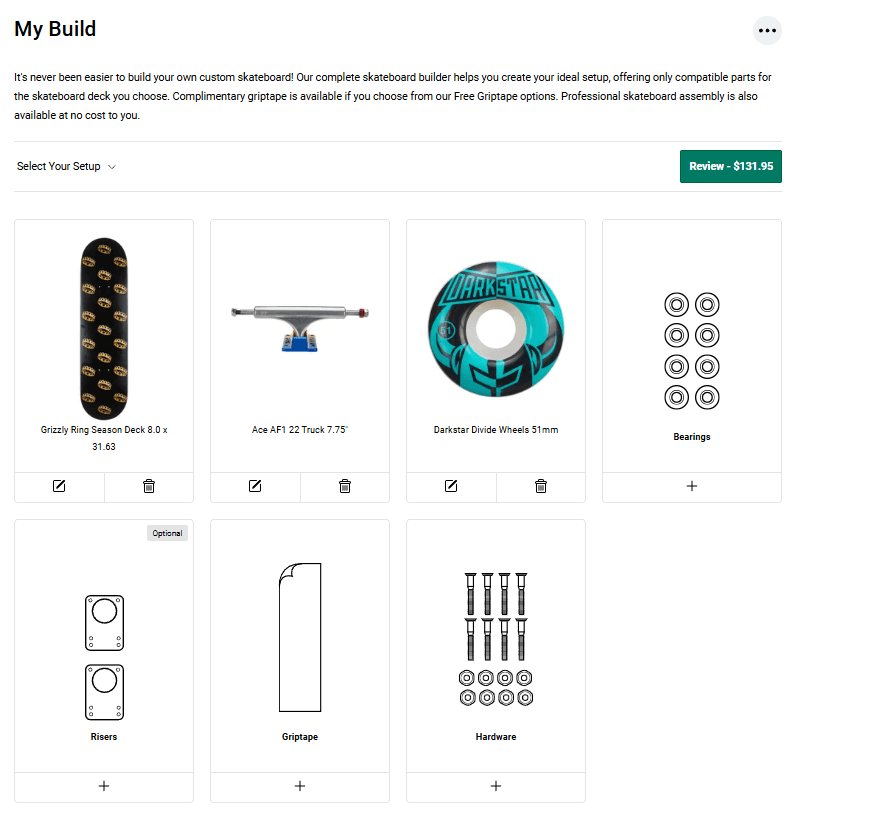
When Ben returns to the site, he navigates over to the “Build a Custom Skateboard” tab. He is then taken to a page where he can select a deck for his skateboard. There is a tab for the normal designs, and one for custom user designs. Ben selects his design and hits continue. After he hits this button, a 3D render appears with his deck design on it. Additionally, a progress bar appears at the top of the screen. Ben goes through, selecting the proper wheels, bearings, and trucks for his deck. When a type of component is not compatible with his current build, it is given a faint red overlay. Eventually, Ben finishes designing his skateboard, and chooses “Add to Cart”. From there, he follows a standard checkout interface, and after placing the order is sent a tracking number and a receipt for his purchase.”
——————————————————————————————————————————-
Although not every feature described in this user story was included in the final design, it helped lay the foundation for what kind of interface I wanted to create. Additionally, it helped give me a better Ideas as to who I was designing this interface for.
DESIGN SYSTEM
From there, I began creating a design system for my interface. This design system helped me determine the colors, typography, and icons I would use to build my final project. The prominent orange and blue colors displayed in this design system portray feelings of excitement, flow, and movement. They are also complimentary colors, meaning they clash off each other which fits with the rebel nature of skateboarding.
Additionally, the "S" in the logo is reminiscent of the "S" design students would draw on papers and desks in school. It fits in with other skateboarding brands and touches on the rebellious nature of adolescents. Overall, I wanted the design system to show a sense of the rebellion associated with skateboarding while also providing the sleekness of a modern interface.
VERSION 1
The following is the first prototype I created in Figma for Steezy. The interface allows users to go through a simplified board building process, selecting their deck, trucks, wheels, bearings, grip tape, risers, and hardware. After creating their board, a user can go through the checkout process by adding a board to their cart and completing their checkout. Check out version 1 here:
COLLEAUGUE ASSESMENT
After finishing version 1 of my product, I conducted colleague assessments and had them review the interface. I read them a version of my preliminary user testing script and had them perform a certain task on my interface. Afterwards, they gave me feedback on my interface. From the feedback I received, my colleagues noted:
They liked the overall structure of my interface
They thought the oranges and blues provided good contrast in the interface
There was no way to go back and make changes to their previous selections
There was no way for them to see their previous selections aside from the three-dimensional render
VERSION 2
After finishing my colleague assessment, I went back and made some more changes to my interface, iterating on version 1. This version features fixes for some of the problems faced by users in my colleague assessment. I agreed with users that having a way to see your previously selected items and being able to go back and make changes to your board were vital for the success of the interface. The prototype for version 2 can be found here:
USER TESTS
Next, I conducted multiple rounds of user tests to gain more insight into my product. Like the colleague assessment, I read users a script explaining the process, asked them some preliminary questions, and then instructed them to perform a certain task on the interface. The questions mostly pertained to their knowledge of using web interfaces, and their expertise with skateboarding. The task consisted of something such as “build a custom skateboard and proceed to checkout”. I then had the users go through the assigned task and provide me feedback along the way.
All the users I interviewed were able to complete the task, but they did face minor frustrations along the way. Additionally, they provided me some general feedback at the end of each interview that I collected. The most important feedback I received is as follows:
Users wanted a progress indicator during the board building process that would tell them how long they had left
Although there were arrows showing that you could spin the three-dimensional model of the board, there was no functionality in place yet
Users felt overwhelmed having multiple buttons appear when they clicked on a product
Users were not able to view a product and see a more in-depth description about it
Some users weren’t sure what some items were used for since they didn’t have prior skating experience
The front page wasn’t as visually interesting as it could be
The footer and the header being the same color made the website feel amateur
The icons in the header were too large
The full logo should be placed in the top left corner with the alternate logo placed in the bottom right corner
VERSION 3
Once I finished conducting my user tests and receiving feedback, I began mapping and making changes to my prototype. To achieve this, I assigned each problem a t-shirt size rating (see more here) and a priority. From there, I put the problems into lists based on their t-shirt size and priority and selected which ones I would implement. After selecting from these lists, I chose to implement the following solutions:
Create a progress bar and corresponding number letting the user know how much of the building process they have left
Reasoning: Users will be more likely to complete the process if they know how much is left, and won’t feel as in the dark about the length of the process
Implement simple functionality to show that the skateboard is an interactable three-dimensional model
Reasoning: Allowing users to move around the board gives them a deeper understanding of what the final product will look like
Have buttons originally appear as greyed out, and then increase the opacity as they become interactable
Reasoning: By having buttons initially greyed out, it doesn’t overwhelm the user when they appear on the screen
Include a pop-up for each product with a more in-depth description of it
Reasoning: Allowing a user to view more information of each product will give them a deeper understanding of that product before they add it
Include an information pop-up, giving more detailed information about what that item is used for
Reasoning: Since not every user will have in-depth skating knowledge, it’s important it’s readily accessible there on the site
Add a low-opacity background to the website of a warehouse
Reasoning: This will make the website more visually interesting and helps show the ideals of the site
Make the footer a different color than header
Reasoning: This will give the user a clearer distinction between the header and footer of the site
Make the icons in the header smaller
Reasoning: This will make the website appear more professional and give it a better design balance
Put the primary logo in the top-left of the website with the alternate logo in the bottom-right
Reasoning: This will give the website clearer brand distinction and make it easier for the user to recognize the home icon
Along with these changes, I wanted to make sure my UI followed two important ideals. The first of these ideals is authenticity. I didn’t want the interface to feel like it was trying too hard to be something it’s not. Skateboarders are very good at picking up on unauthentic people and will typically label them as posers. This is why I chose to include skateboard lingo without making it seem like I was overly-catering to them.
The other ideal I wanted my UI to follow is expression. Skateboarders are known for expressing themselves through their tricks, music, and fashion. I wanted to empower my users and give them freedom of expression to help their ideas come to life. This is why I implemented numerous customization options for the site. Lastly, I plan to add features like a custom deck tool as shown in my sketches, and a community designs page which allows the community of users to submit their designs to be voted on for a chance to be featured on the website.
The final version of my interface can be accessed here. As I mentioned in narrative, I plan on adding additionally changes in the future, but this is where my design currently stands:
CHALLENGES
This project definitely wasn't without it's challenges. One of the biggest challenges I faced was the different states I needed to create all the pages for this website. Although I had done project using Figma in the past, I had never done something to this scale. Therefore, when it came to creating different states for the board, I created a different page for each state. This caused what you see below as a spider web of interactions and is very hard to understand/maintain. Now that I've become comfortable creating components, I would go back and create components for the different pieces of my website, with states for each interaction, ultimately making the design more maintainable, understandable, and cohesive.
The other challenges I faced in this project was getting enough data. Although user interviews helped me understand certain pain points in my project, I wish I had more quantitative data to play around with and influence my designs. Additionally, getting user interviews with a wider age range of users would've helped me improve both my design, and the information displayed on the website.

THE FUTURE
Eventually, I want to bring Steezy to life. In the future, I hope to add features such as the custom board creation, community contests, and personalized accounts. I want the platform to be more than just an ecommerce website. I would like to see it become a place where users can not only express themselves through the creation of a custom skateboard, but also connect with the broader skateboarding community.
When it comes to development, I would create the skateboard designs using Blender, and then import them into a web application, rendering them with React.
© Zach Girouard 2024